
When I first started PR Design, I thought the course would mainly focus on making projects look professional. While design is certainly an important part of public relations, I quickly learned that effective PR design is about much more than creating something visually appealing. Every color, font, image and layout decision communicates a message. Throughout this course, I discovered that successful design combines creativity with strategy to help organizations connect with the right audience.
PR Design Is Strategic Communication
Public relations design is the process of creating visual materials that support an organization’s goals and communicate messages clearly. Whether it’s a brochure, newsletter, social media graphic or media kit, every piece should reinforce an organization’s brand while providing information that is easy to understand.
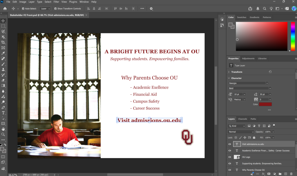
Throughout this semester, I used several industry-standard tools to create professional materials. Adobe InDesign became my primary tool for developing brochures, newsletters and other print publications because it offers precise control over layout and typography. I also used Adobe Photoshop to edit images and improve visual quality, while WordPress allowed me to publish blog posts and build an online portfolio. Together, these tools helped me understand how PR professionals create consistent communication across multiple platforms. While learning Photoshop, I found this beginner tutorial helpful as I developed my image editing skills and learned how to create more polished visual content for my projects.
Knowing Your Audience Comes First
One of the biggest lessons I learned is that good design always begins with understanding the audience. Before creating any publication, I had to think about who would be reading it, what information they needed and how they preferred to receive that information.
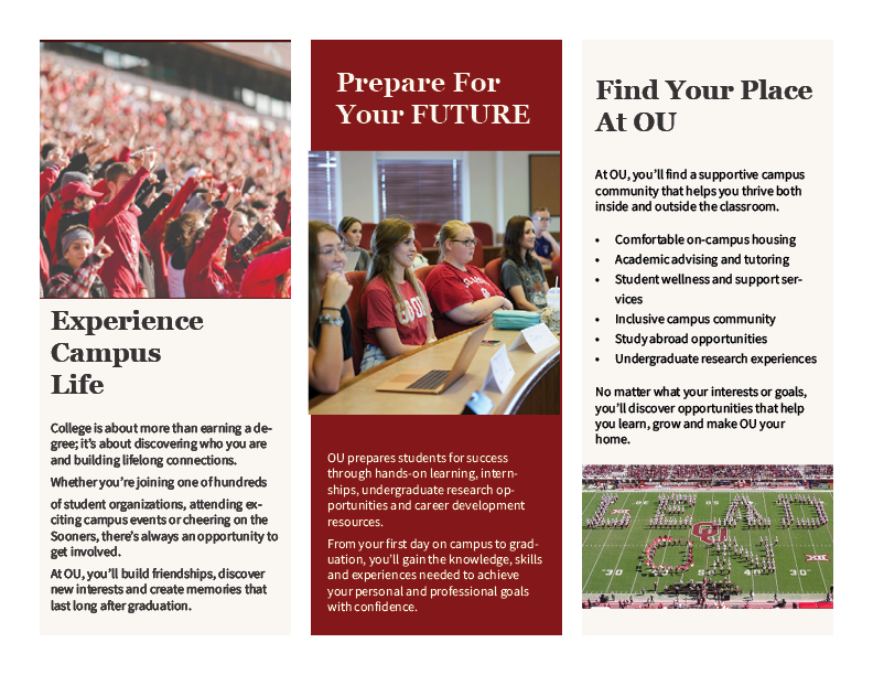
For my University of Oklahoma admissions materials, every design decision was made with prospective students in mind. I selected welcoming photography, organized information into clear sections and used the university’s official colors to create familiarity and trust. Instead of designing for myself, I learned to design for the audience.
This is an example of the inside of a brochure I created for the University of Oklahoma Admissions & Recruitment.
Good Design Builds Credibility
This course also taught me that strong design helps establish credibility. Publications that use consistent branding, organized layouts and readable typography appear more trustworthy and professional. Even small details, such as proper spacing, alignment and image placement, affect how readers perceive an organization.
My projects became stronger as I paid closer attention to design principles like balance, contrast, repetition, alignment and proximity. I also gained a greater appreciation for typography after learning how font choices and spacing influence readability and the overall message. I explored this topic further in my blog post, The Power of Typography, where I discussed how thoughtful typography can strengthen communication and reinforce an organization’s brand identity.
Looking Back
This course challenged me to think like a public relations professional instead of simply a designer. Every assignment required me to balance creativity with purpose while keeping the audience at the center of every decision.
Working through each assignment showed me that effective design requires thoughtful planning, attention to detail and a willingness to revise. Small choices, whether adjusting color, refining a layout or selecting the right images, can completely change how a message is received. I also gained a deeper appreciation for how all of the elements of design work together rather than independently. A successful publication isn’t built around one strong feature; it’s the combination of visual elements that creates a clear, engaging experience for the audience.
Resources
Envato Tuts+. (2020). Photoshop for beginners | FREE COURSE [Video]. YouTube. https://www.youtube.com/watch?v=IyR_uYsRdPs.
Miller, R. (2026). The power of typography. Rily Miller. https://rilymiller.com/the-power-of-typography/.