Creating direct mail pieces in Photoshop gave me a much better understanding of both graphic design and audience-focused communication. Before this project, I mainly viewed Photoshop as a tool for editing photos and creating graphics. After designing two mailers for different stakeholders, I learned that Photoshop is a powerful design tool that helps communicate information to specific audiences while maintaining a consistent brand identity.
My Thoughts on Photoshop
Photoshop can seem overwhelming at first because there are so many tools, settings and options available. However, once I became familiar with layers, text tools and alignment features, I found that Photoshop offered a great deal of creative freedom. It allows designers to experiment with layouts, typography, colors and images while maintaining control over every detail.
One thing I enjoyed most about Photoshop was the ability to make changes throughout the design process. Unlike traditional design methods, Photoshop allows users to test different ideas and quickly revise their work. This flexibility made it easier to improve my mailers and create stronger final products.
My advice is to start with a clear understanding of the audience and message before designing. Once I identified what mattered most to each stakeholder, it became much easier to choose images, headlines and layouts that supported the purpose of each mailer.
The Importance of Stakeholders
One of the most valuable lessons from this project was understanding how different stakeholders influence design decisions. My primary stakeholder was Mia Rodriguez, a 17-year-old high school senior from Dallas who is researching colleges and looking for a university that offers academic success, student involvement and future career opportunities. My secondary stakeholder was her father, David Rodriguez, who serves as a decision influencer and is focused on affordability, safety and educational quality.
To better understand the needs of both stakeholders, I reviewed information from the University of Oklahoma Admissions and Recruitment website. The site provided information about academics, scholarships, campus life, admissions requirements, and student resources that helped shape the content of both mailers.
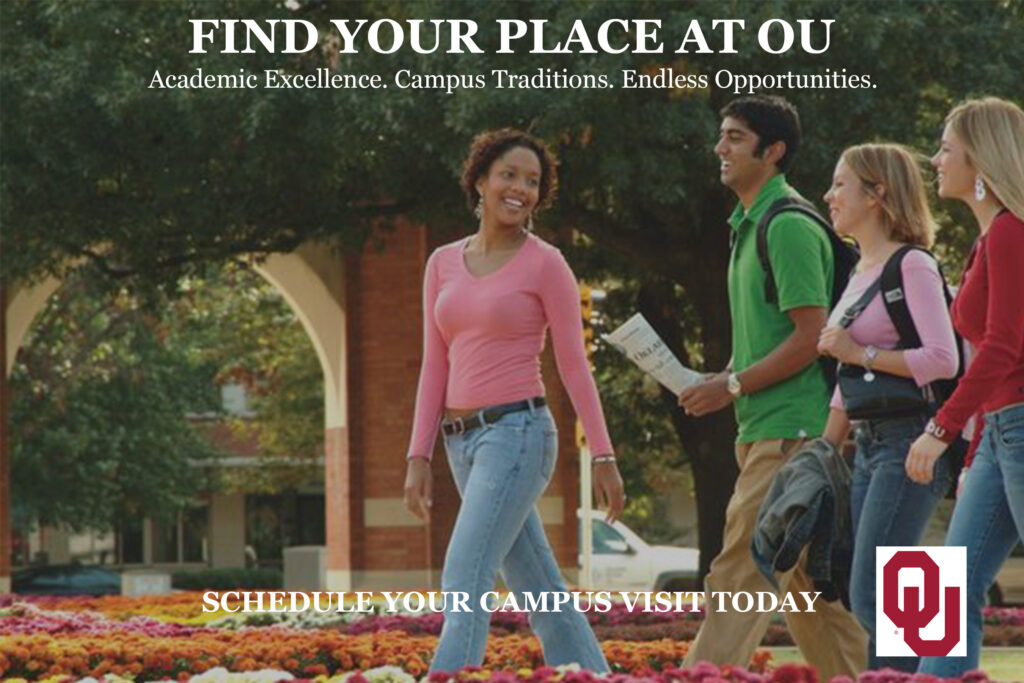
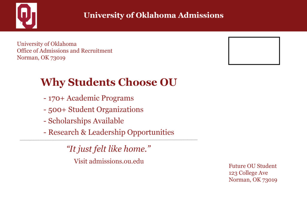
Although both stakeholders are interested in the University of Oklahoma, they have different priorities. For Mia, I created a design that emphasized campus life, academic opportunities and the overall college experience. The front of the mailer featured students walking on campus with the headline Find Your Place at OU because prospective students often want to imagine themselves as part of the university community. The back highlighted academic programs, student organizations, scholarships and leadership opportunities that would appeal to a future student preparing for college.
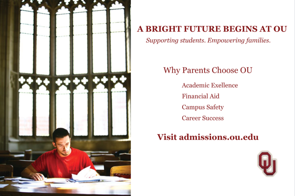
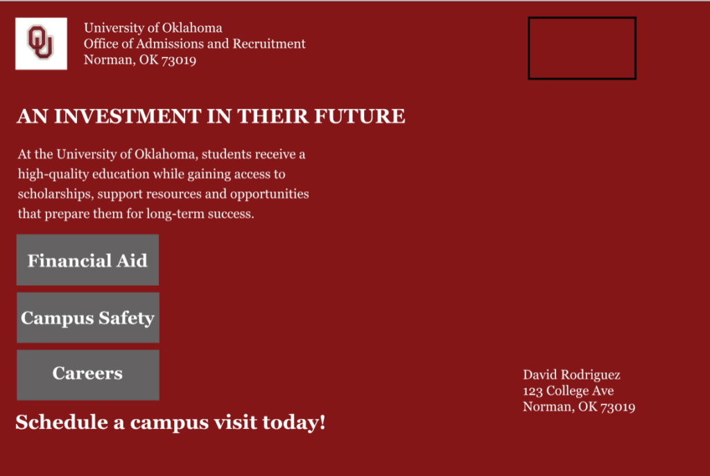
The first stakeholder helped define the second stakeholder because both mailers needed to maintain the same OU brand identity. After establishing the color palette, typography and overall visual style for Mia’s mailer, I adapted those elements for David’s mailer. While the branding remained consistent, the content shifted to focus on the concerns of parents, including academic excellence, financial aid, campus safety and career success.
How a Design Evolves During Drafting, Reviewing and Finalizing
One of the biggest lessons I learned was that strong designs develop through multiple revisions. My original layouts were much different than the final versions. During the drafting stage, I focused on organizing content and creating a visual hierarchy that would capture attention.
As I received feedback, I made several changes to improve the effectiveness of the designs. For example, I adjusted spacing, alignment and branding placement to create better balance throughout the mailers. I also had to consider direct mail requirements, such as making the mailing address area more visible and ensuring the layout would function as a real postcard.
Several factors influenced my revisions. Stakeholder needs influenced what information was emphasized, instructor feedback improved the visual presentation and branding requirements ensured both mailers remained connected to the University of Oklahoma Admissions and Recruitment department. Each revision made the designs more professional and audience-focused.
Photoshop Tips and Design Skills
After completing these projects, I would offer several pieces of advice to new Photoshop users:
- Organize layers and name them clearly.
- Use guides and alignment tools to keep layouts balanced.
- Save your PSD files frequently.
- Start with a simple design before adding additional elements.
- Choose images that support the message and audience.
- Be willing to revise your work after receiving feedback.
The most important lesson I learned is that good design is not created in a single draft. The strongest designs are developed through testing, reviewing and refining.
Photoshop helped me improve my understanding of typography, visual hierarchy and audience-centered design. Creating mailers for both a prospective student and a parent showed me how design choices can influence communication. The software allowed me to experiment with different layouts and refine my work, helping me become a stronger and more strategic designer.
One resource I would recommend for beginners is PiXimperfect’s Photoshop tutorial on YouTube. The video explains many of the basic tools and techniques in a way that is easy to follow, making it a great starting point for students who are new to Photoshop. Resources like this helped me become more comfortable navigating the software and completing my designs.
References
PiXimperfect. (2026, April 2). Photoshop for beginners | Complete course [Video]. YouTube. https://www.youtube.com/watch?v=OKkWRpoIFuw.
University of Oklahoma Admissions & Recruitment. (n.d.). University of Oklahoma admissions. https://www.ou.edu/admissions.