
A brochure may seem like a simple marketing piece, but it is one of the most effective public relations tools an organization can use. A well-designed brochure combines strategic writing, eye-catching visuals and thoughtful design to communicate a brand’s message in just a few panels. Throughout this project, I learned that creating an effective brochure involves much more than arranging text and images. Every design decision should support the audience’s needs while strengthening the organization’s overall brand.

Cover of the brochure I created
Designing With the Audience in Mind
One of the biggest lessons I’ve learned throughout this course is that every public relations piece should begin with the audience. According to a HubSpot article, understanding who you’re trying to reach helps shape everything from your messaging to your overall marketing strategy. My brochure was designed for high school students who are exploring colleges, along with their parents and families. Because of that, I wanted the information to be welcoming, easy to understand and visually engaging.
Instead of filling each panel with long paragraphs, I focused on short sections, clear headings and bullet points that quickly highlight the benefits of attending OU. I also wanted the brochure to create an emotional connection by helping readers picture themselves walking across campus, getting involved in student organizations and preparing for their future. If someone only spends a few minutes looking through the brochure, they should still walk away with a positive impression of the university.
Letting the Design Do Some of the Talking
One thing I enjoyed most about this project was bringing together everything we’ve learned about design this semester. Rather than simply placing text wherever it fit, I paid close attention to balance, alignment and consistency so the brochure would feel polished and professional. Adobe InDesign reinforced many of these techniques we practiced in class.
I used OU’s crimson and cream colors throughout the brochure to strengthen the university’s identity and paired them with large campus photos to make each page feel welcoming and energetic. I also made sure the fonts, spacing and layout stayed consistent across every panel. Those small details create harmony and visual agreement, making the brochure easier to read while giving it a cohesive look from beginning to end. I found that good design isn’t just about making something attractive; it helps communicate the message more effectively.


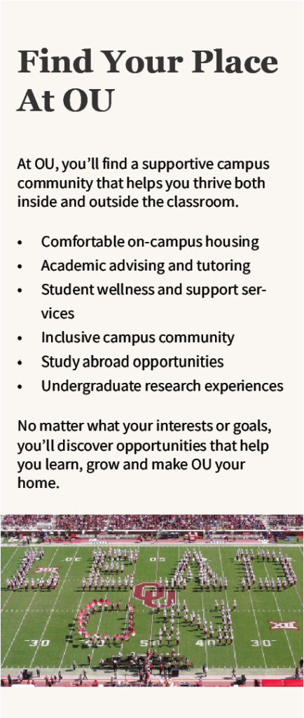
These are the inside panels of my brochure.
Why Brochures Continue to Be an Effective PR Tool
Even though organizations rely heavily on websites and social media today, brochures still have an important place in public relations. They’re something people can pick up during a campus tour, college fair or admissions event and look through whenever they have time. A well-designed brochure gives readers the most important information in a format that’s both organized and memorable.
Looking back, this project challenged me to think like both a designer and a public relations professional. I wasn’t just creating something that looked nice; I was creating a piece that represents a brand and speaks directly to its audience. Every headline, image and design choice had a purpose. Completing this brochure gave me a greater appreciation for how thoughtful writing and strong visual design work together to leave a lasting first impression, and it’s a project I’m proud to add to my portfolio.
References
Adobe. (n.d.). Learn InDesign. Adobe. https://www.adobe.com/learn/indesign.
Schilthuis-Ihrig, K. (2026, March 18). Target audience: How to find yours [+ real-life examples]. HubSpot. https://blog.hubspot.com/marketing/target-audience.