
When people think about personal branding, they often focus on social media profiles or websites. However, traditional collateral materials still play an important role in creating a professional image. A well-designed business card, letterhead and envelope work together to communicate personality, professionalism and attention to detail.
For this project, I created a complete stationery package that reflected my personal brand. Throughout the design process, I researched best practices, revised multiple drafts and incorporated feedback to create materials that were visually consistent and professional.
Why Consistency Matters
One of the most important principles of collateral design is consistency. Every piece should feel like it belongs to the same organization or individual. To achieve this, I used the same color palette, typography and design elements throughout my business card, letterhead and envelope.
My primary brand color is pink, which is already a major part of my personal website and online presence. By carrying that color through each piece of collateral, I created a recognizable visual identity that reflects my personality while maintaining a professional appearance. According to a Forbes Communications Council article, consistency in branding helps organizations build trust, strengthen recognition and create a more memorable experience for audiences (Wong, 2024).
Designing for Balance and Harmony
Good design is more than making something look attractive. Effective collateral materials use principles such as balance, alignment and harmony to guide the viewer’s attention.
For my stationery package, I used diagonal pink accents to create visual interest while keeping the layouts clean and organized. I also paid close attention to spacing and alignment to ensure information was easy to read.
Balance was especially important because each piece contains different amounts of information. The business card includes contact information and social media handles, while the letterhead leaves plenty of white space for written communication. The envelope serves as both a mailing piece and a branding opportunity.
According to Metaform Design, balance and harmony are essential principles that help create visual stability and a sense of unity within a design (Phillips, 2023). When elements are thoughtfully arranged, viewers can process information more easily and develop a stronger overall impression of the brand. These principles guided many of my design decisions throughout the project.
Business Card: Making a Strong First Impression
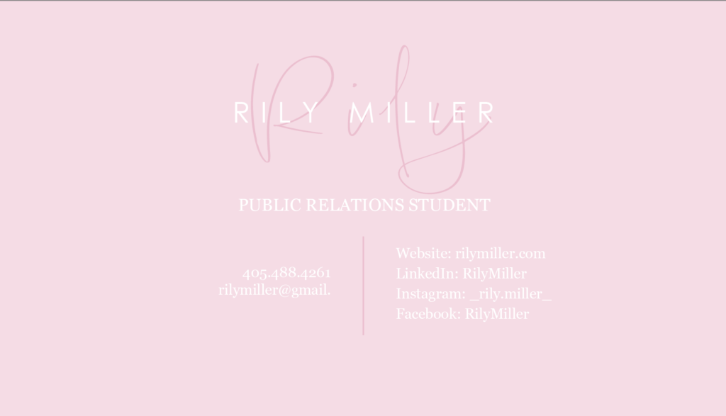
The business card serves as a quick introduction to who I am professionally. I wanted the design to feel modern, approachable and memorable.
To accomplish this, I used a clean layout with clear contact information and a prominent display of my name. The script signature element adds personality, while the simple typography ensures readability.
Since business cards have limited space, every design choice must be intentional. Limiting the number of colors and fonts helped keep the design clean and uncluttered.
Letterhead: Professional Communication
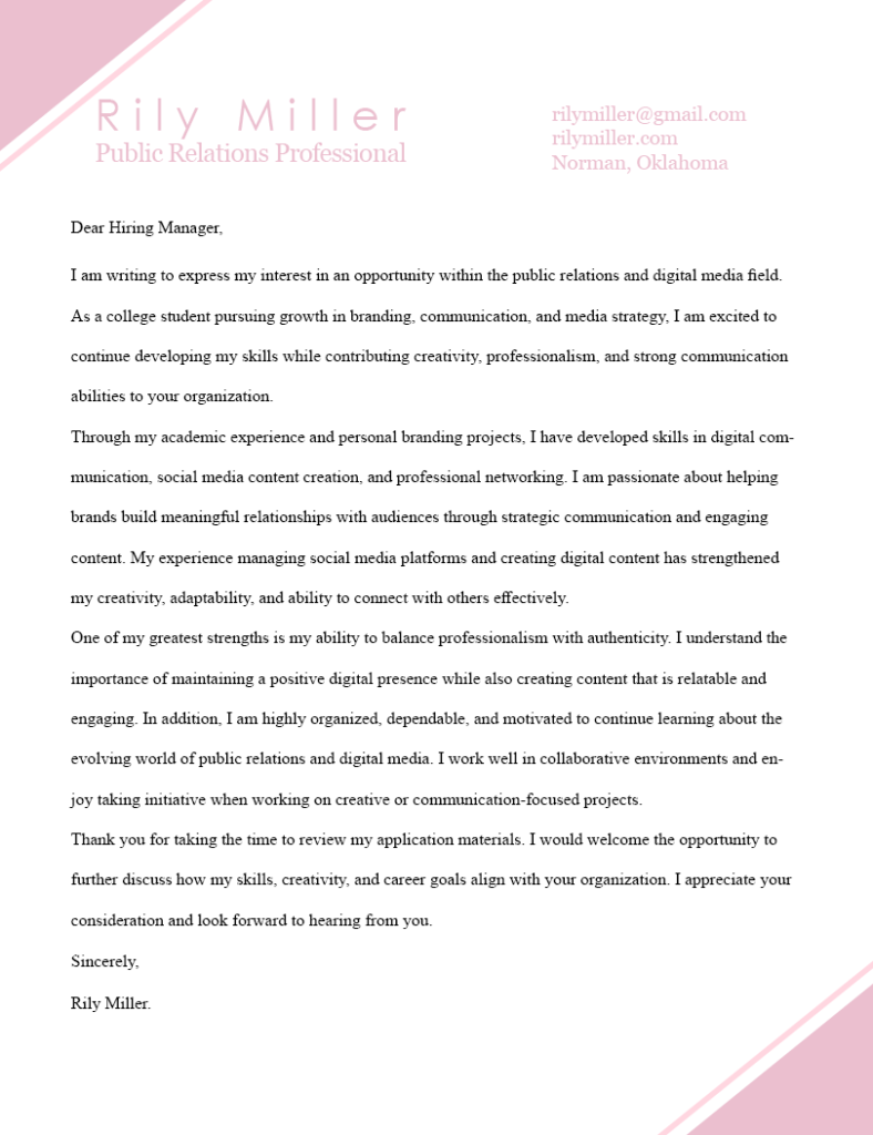
The letterhead required a different approach because it functions as a communication tool. While branding remains important, readability becomes the top priority.
I placed my contact information at the top of the page and used subtle design elements in the corners to reinforce my brand identity without distracting from the body text. The result is a professional document that balances personality with functionality.
Envelope: Extending the Brand Experience
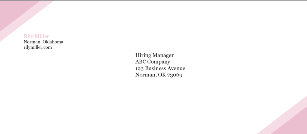
An envelope is often the first physical piece someone sees before opening a document. As a result, it plays an important role in creating a positive first impression.
I incorporated the same pink accents and typography used throughout the stationery package while ensuring enough clear space remained for mailing information. This approach helps maintain brand consistency while preserving functionality.
What I Learned
This project taught me that successful collateral materials require both creativity and strategy. Every design decision should support a clear purpose while contributing to a unified brand identity.
By focusing on consistency, balance, harmony and readability, I created a stationery package that reflects my personal brand and presents a professional image. These principles can be applied to any organization or individual looking to strengthen their visual communications.
References
Phillips, L. (2023, February 16). Exploring the principles of balance and harmony in design. Metaform Design. https://www.metaformdesign.com/design-theory/exploring-the-principles-of-balance-and-harmony-in-design/.
Wong, J. (2024, December 30). The importance of consistency in branding. Forbes Communications Council. Forbes. https://www.forbes.com/councils/forbescommunicationscouncil/2024/12/30/the-importance-of-consistency-in-branding/.