
Research is one of the most important steps in creating an effective communications strategy. Before designing any collateral materials, such as a business card, letterhead, or envelope, it is important to understand how visual elements communicate a message. By analyzing brands that align with my personal style and professional goals, I have been able to identify design choices that reflect the image I want to present.
Creating a Visual Language
One of the biggest lessons I learned through my research is that visual language should be consistent. The brands I analyzed all used cohesive colors, typography and imagery to communicate their personalities. For my own brand, I plan to use a clean, modern visual language that feels professional yet reflects my personality.
Pink will remain my primary brand color because it is already incorporated into my website and personal branding. Research shows that pink is often associated with femininity, warmth, compassion and approachability. These qualities align with how I want others to perceive me as a future public relations professional.
Type-Driven or Image-Driven?
My collateral materials will be primarily type-driven. Since a business card has limited space, typography plays a major role in conveying professionalism and credibility. I want the design to feel organized, polished and easy to read. According to a LinkedIn article on typography and image integration, effective design uses hierarchy, alignment and contrast to guide viewers’ attention and improve readability. These principles will help ensure that my branding materials communicate information clearly while maintaining a professional appearance.
While images will not be the primary focus, I may incorporate subtle design elements or graphics that complement the overall aesthetic. Any visual elements should support the information rather than distract from it.
What Should the Design Communicate?
Every design choice sends a message. The typography I choose should communicate professionalism, reliability and attention to detail. Clean fonts with strong readability will help reinforce these qualities.
The color palette should communicate creativity and confidence while remaining polished enough for professional settings. By keeping the design simple and cohesive, I can ensure that the focus remains on the information while still creating a memorable impression.
Visualizing My Business Card
As I begin to picture my business card, I imagine a clean layout with pink as the primary accent color. My name and contact information will be clearly displayed using modern typography with strong visual hierarchy. The overall design will be minimalistic, organized, and easy to read.
When someone receives my business card, I want it to communicate that I am creative, detail-oriented, and professional. Research has helped guide each of these decisions, ensuring that every design element supports the message I want my personal brand to convey.
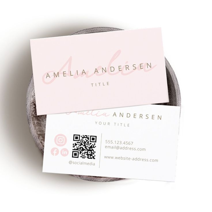
This is a picture I found for inspiration. I was drawn to the soft pink color palette, elegant script typography and clean, professional layout.
Why Research Matters
Research provides the foundation for strong communication design. Rather than making decisions based solely on personal preference, research helps ensure that colors, typography and visual elements align with the intended message. As I continue developing my collateral materials, the insights I gained from analyzing successful brands will help me create designs that are both visually appealing and strategically effective.
References
LinkedIn. (n.d.). What are the most effective examples of typography and image integration? LinkedIn Advice. https://www.linkedin.com/advice/0/what-most-effective-examples-typography-image-integration.
Zazzle. (n.d.). Elegant script blush pink business card [Business card design]. Zazzle. https://www.zazzle.com/elegant_script_blush_pink_business_card-256284598075296808?utm_source=Pinterest&utm_medium=organic&epik=dj0yJnU9U1cyWGtqeWRWOU1iMERaWDlqZjZXdFp4YjRQUGl3RS0mcD0wJm49a3didzdPUDJ1dlN6SHlzU0xrMlQ0QSZ0PUFBQUFBR29lV3Vj.