Typography is everywhere. From social media graphics and advertisements to websites and magazines, typography plays a major role in how people experience information. While many people may only think typography is about choosing a font, it is actually much more than that. Typography is the art and technique of arranging text in a way that makes written language readable, visually appealing and effective. Good typography can completely change the way a message is understood and remembered.
The Importance of Kerning
One of the most important things I learned while exploring typography is how much spacing matters. Kerning, which is the spacing between individual letters, may seem like a small detail, but it can greatly impact readability and design quality (TypeType, 2024). To practice this skill, I played the typography game called Kern Type. The goal of the game is to adjust the spacing between letters to create balanced and readable typography. At first, the spacing differences seemed difficult to notice, but after a few rounds, I began recognizing how uneven spacing can make text look awkward or unprofessional.
Here are screenshots I took while playing Kern Type:
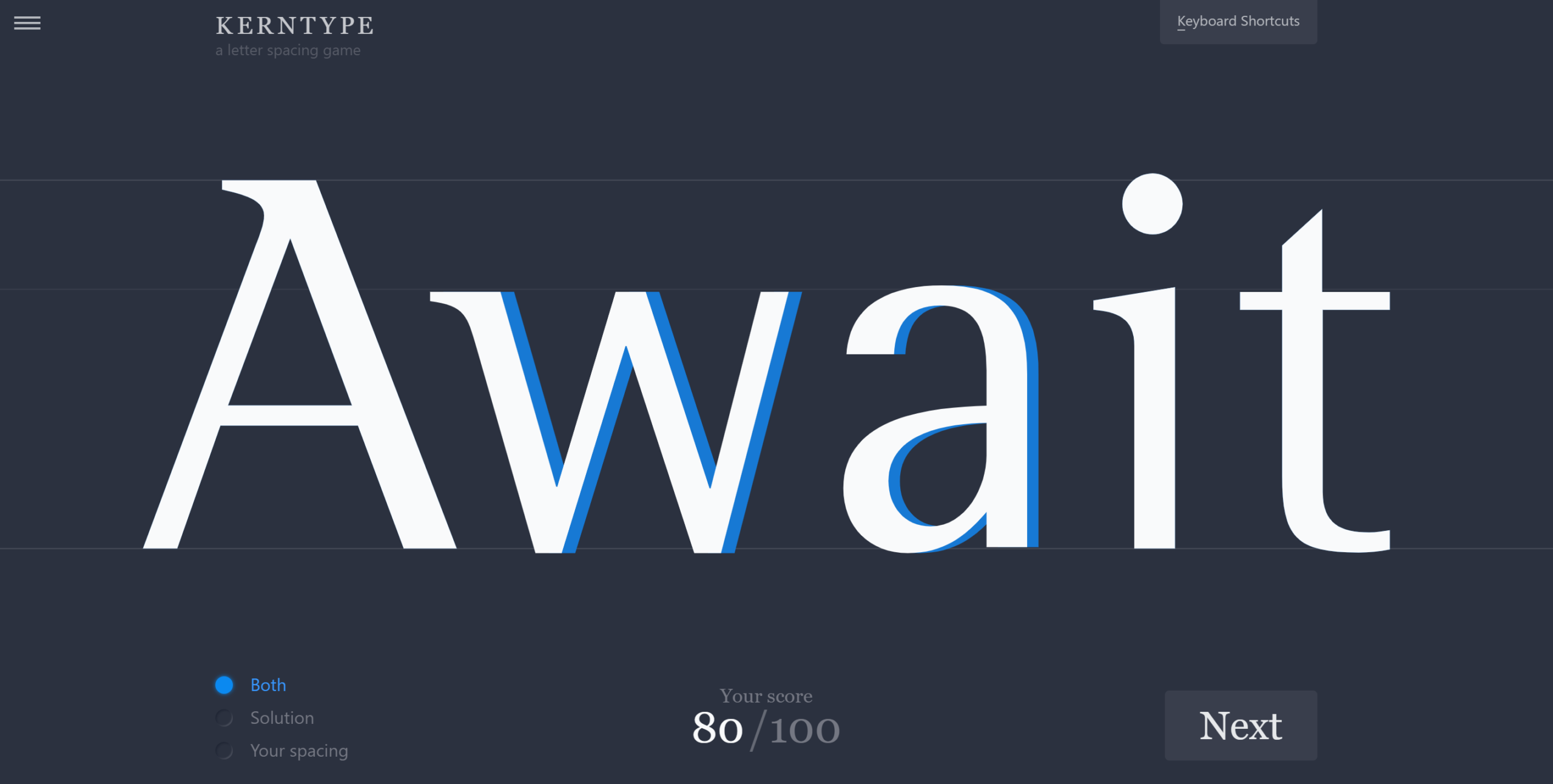
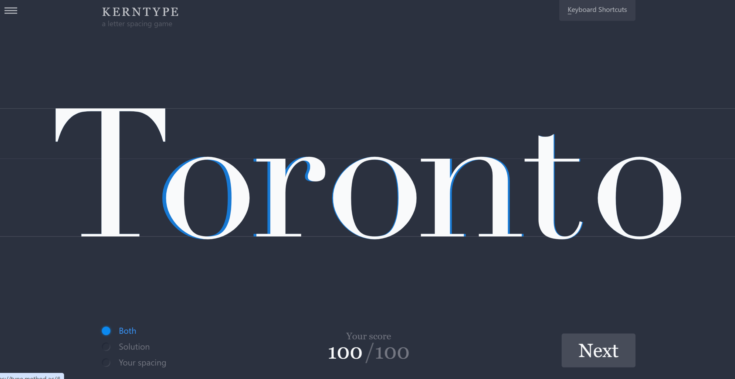
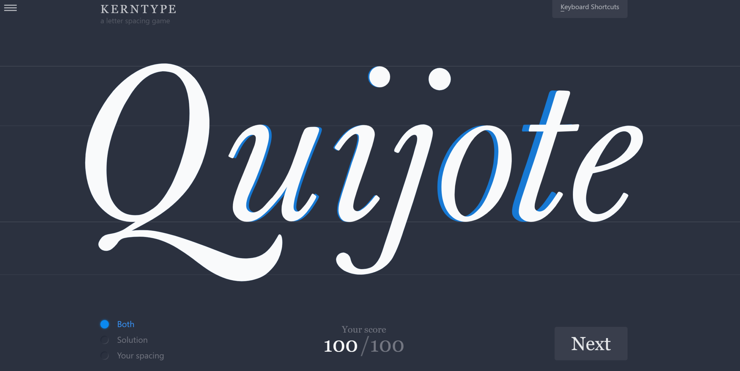
Playing the Kern Type game helped me better understand why typography details matter so much. Small spacing adjustments between letters can impact readability, professionalism and the overall appearance of a design. While most people may not consciously notice kerning, they often notice when typography feels awkward or difficult to read. That experience showed me how typography combines creativity with technical precision.
How Typography Creates Emotion and Personality
Typography also creates emotion and personality within a design. Different fonts communicate different moods and messages. According to the article Font Psychology: How Typeface Affects Mood, different font categories are associated with specific emotions and brand personalities (Sandu, 2026). For example:
- Serif fonts often feel traditional, trustworthy and respectable.
- Sans-serif fonts usually appear modern, clean and approachable.
- Script fonts can feel elegant, feminine or personal because they resemble handwriting.
- Display fonts are bold, dramatic and attention-grabbing. They are commonly used in advertisements, movie posters and sports branding because they quickly create excitement and energy.
Designers carefully choose typography styles based on the audience and purpose of the message. A sports brand may use bold, strong typography to create excitement, while a luxury brand may use elegant fonts with thin lines and extra spacing to create sophistication.
The Impact of Typography on Readability
Another important aspect of typography is readability. If typography is difficult to read, audiences may lose interest in the message entirely. Designers use proper hierarchy, spacing, font size and alignment to guide the reader’s eye through information. Headlines are often larger and bolder to attract attention, while body text is designed for easy reading over longer periods of time.
Take a look at the image below:
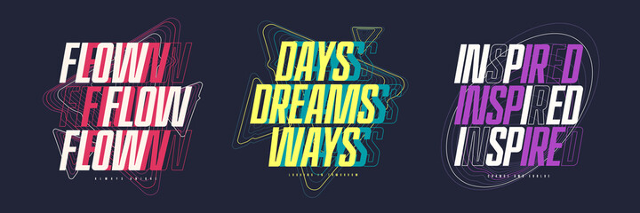
While this typography design is visually engaging, the overlapping effects and spacing demonstrate how creative styling can sometimes reduce readability.
How Typography Strengthens Brand Visibility
Typography is also a major part of branding and visual identity. In the article, Branding and visual identity, I found that visual identity includes elements such as logos, colors, imagery and typography that help organizations communicate their personality and values to audiences (College of Western Idaho, n.d.). Typography is not just about making words look attractive. It helps establish consistency, professionalism and recognition across all forms of communication.
Typography is critical to design because it influences communication, branding and user experience. Even if a design includes great images or colors, poor typography can make the entire project feel unorganized or confusing. Strong typography helps establish credibility and professionalism while improving how audiences interact with content.
One thing I found especially interesting while playing Kern Type was realizing how typography combines both creativity and precision. Designers are not simply choosing fonts randomly. Every spacing adjustment and design choice has a purpose. Typography requires attention to detail, patience and an understanding of how people visually process information.
References
College of Western Idaho. (n.d.). Branding and visual identity. Pressbooks. https://cwi.pressbooks.pub/introductiontopr/chapter/branding-and-visual-identity/.
Sandu, B. (2026, March 29). Font psychology: How typeface affects mood. Design Your Way. https://www.designyourway.net/blog/font-psychology/.
TypeType. (2024, August 19). Kerning, tracking, leading & spacing in typography: What’s the difference? TypeType. https://typetype.org/blog/kerning-tracking-leading-and-spacing-in-typography/.