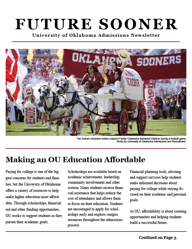
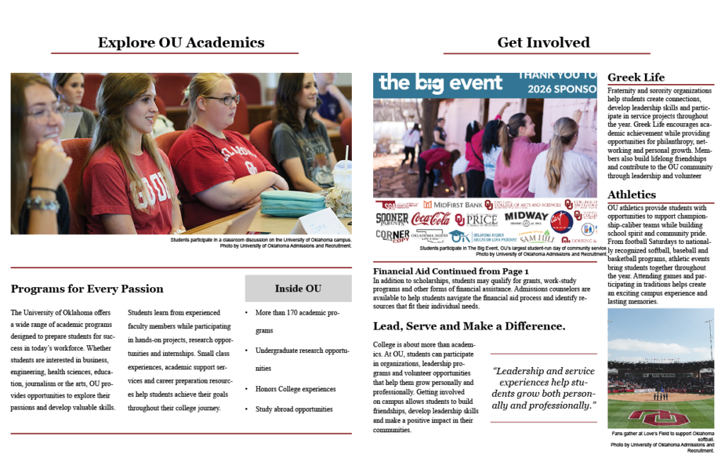
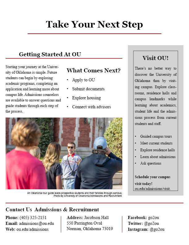
Designing my four-page newsletter was much more than arranging text and photos on a page. Throughout this project, I learned that every design decision, from choosing images to organizing columns, plays an important role in how readers experience the message. A well-designed newsletter doesn’t just look attractive; it helps communicate information clearly while keeping the audience engaged.
Every Photo Should Tell Part of the Story
One of the biggest lessons I learned was the importance of selecting the right photos. Images should do more than fill empty space; they should support the article and reinforce its message. Since my newsletter was designed to encourage prospective students to consider the University of Oklahoma, I chose photos that highlighted campus life, academics, athletics and student involvement. These images helped readers visualize what it would be like to become part of the OU community while making each page more inviting.
I also learned that placing photos near the related article creates a stronger connection between the visuals and the content. A good image can grab attention before a reader even begins reading the text. Adobe explains that using images strategically helps guide readers through a publication and creates a more engaging visual experience.
Designing for Your Audience
Before writing a single paragraph, I had to think about who would be reading my newsletter. My audience was prospective students and their families, so I focused on writing in a positive, informative and welcoming tone. Instead of overwhelming readers with too much information, I used short paragraphs, descriptive headings and clear calls to action that made the content easy to follow.
Targeting the audience influenced every decision I made, including the language, colors, photos and overall organization of the newsletter. Understanding the audience is one of the most important skills in public relations because effective communication always begins with knowing who you’re trying to reach.
This project also reinforced many of the communication concepts I have learned throughout the semester. In my previous blog about typography, I discussed how strong typography improves readability and helps communicate information more effectively and I applied those same ideas while creating this newsletter.
Bringing Everything Together Through Design
Looking back to the beginning of the semester, I can see how many of the design principles we learned came together in this project. I focused on harmony by using consistent fonts, colors and spacing throughout the newsletter. Visual agreement helped each page feel connected while still giving every article its own space. I also paid close attention to alignment, white space and column placement to create a layout that was balanced and easy to read.
One challenge I faced was arranging multiple articles without making the pages feel crowded. Using consistent spacing, dividers and a three-column grid helped organize the information while maintaining a clean, professional appearance. This project reinforced that good design isn’t about adding more elements; it’s about making intentional choices that improve readability and strengthen the message.
References
Adobe. (n.d.). Learn InDesign. https://www.adobe.com/learn/indesign.
Miller, R. (2026, May 26). The power of typography. Rily Miller. https://rilymiller.com/the-power-of-typography/.