
Good design is everywhere, but so is bad design. After watching the LinkedIn Learning video on layout and composition, I started paying more attention to the signs, buildings and objects I see every day in Norman, Oklahoma. While creating my Design Blitz, I noticed how design choices affect the way people understand information. Some designs immediately communicate their message clearly, while others feel cluttered or confusing.
In graphic design and public relations, visuals are important because they shape how audiences interpret information. Concepts like form, function, message, color, minimalism and symbols all work together to create effective communication. I took photos of everyday signs, buildings and objects to analyze both successful and unsuccessful examples of design principles in real-world situations.
Form, Function and Message: Classic 50’s Drive-In Menu
The concept of form, function and message refers to how a design looks, how it works and what it communicates to the audience. A successful design balances all three elements so viewers can quickly understand the information. According to UX World (2024), effective design balances visual appeal with usability, meaning a design should not only look aesthetically pleasing but also help users easily accomplish their goals.
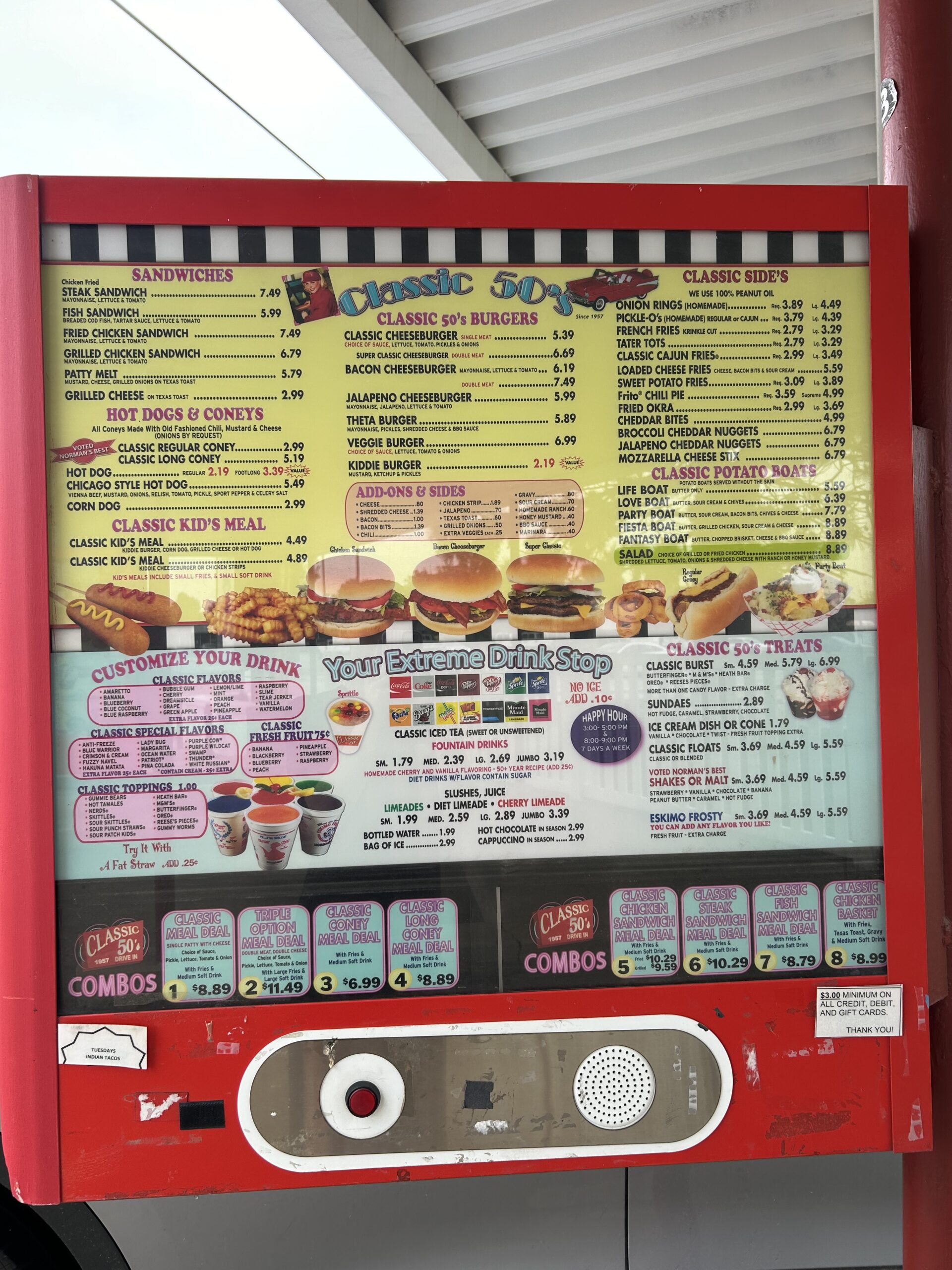
This drive-in menu is an example of poor form and function because it is overcrowded with information. The bright colors and retro typography fit the restaurant’s 1950s theme, which supports the message and branding. However, the layout is difficult to read because there are too many menu items, font styles and sections competing for attention.
The lack of white space also makes the menu visually overwhelming. Customers may struggle to locate prices or menu categories while ordering quickly. Even though the theme is clear, the cluttered composition diminishes the design’s effectiveness.
Color and Branding: Neighborhood JAM
Color plays an important role in branding because it creates recognition, mood and personality. Designers use color strategically to help businesses stand out and communicate their identity.
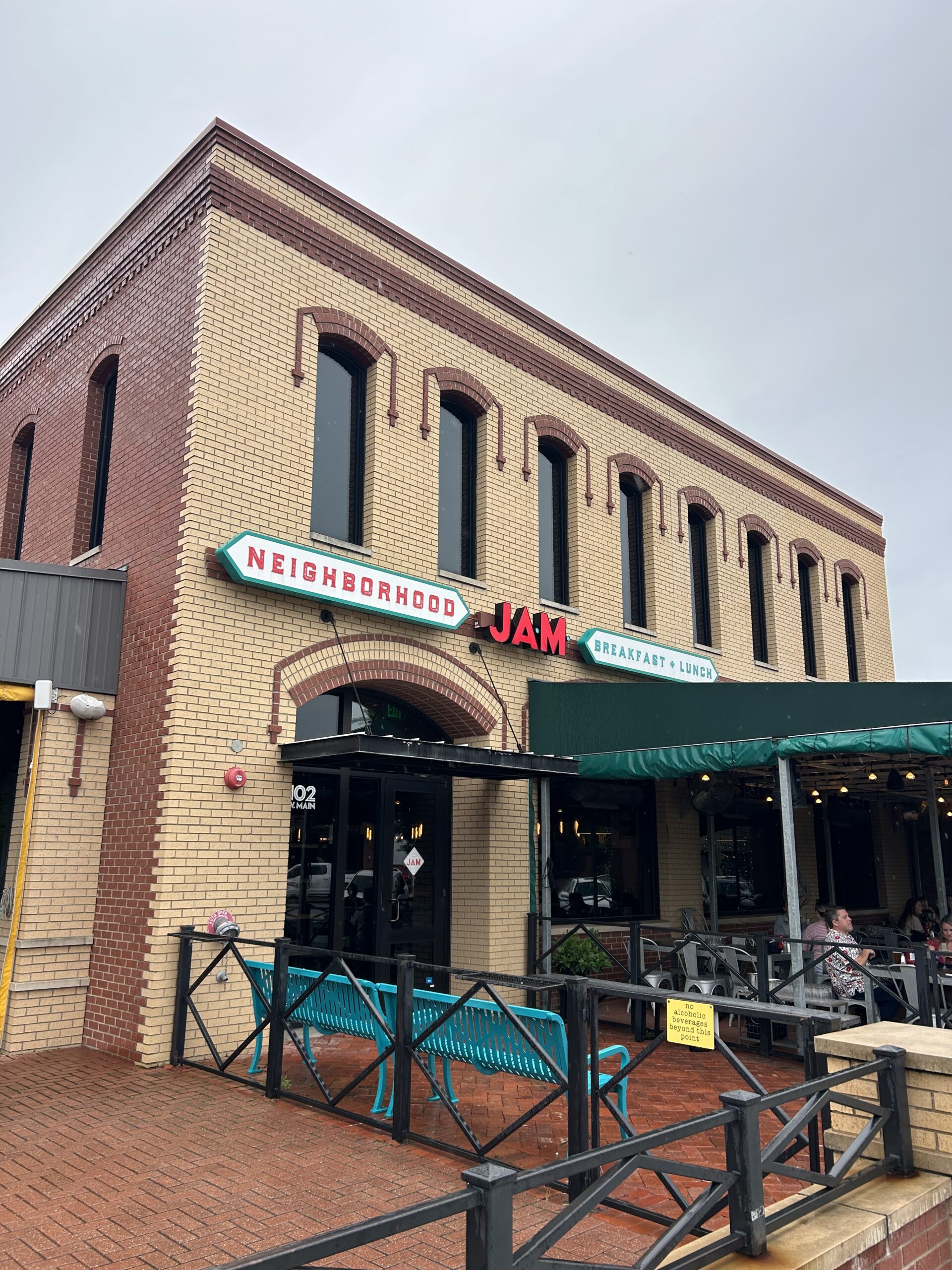
Neighborhood JAM uses bright teal and red colors to create an energetic and welcoming appearance. The colors contrast well against the neutral brick building, making the sign highly visible from the street. The retro-inspired typography also supports the restaurant’s fun and casual atmosphere.
I thought this was a strong example of color in design because the branding feels consistent and memorable. The bold colors attract attention without overwhelming the viewer, and the spacing between the signs keeps the design balanced.
Minimalism and Use of Space: Road Construction Signs
Minimalism is a design principle that focuses on simplicity and removing unnecessary visual elements. Effective use of space helps viewers quickly process information without feeling overwhelmed.
This road construction scene is an example of poor minimalism and ineffective use of space. There are multiple road signs, barrels and barricades crowded together, which creates visual clutter. Because so many elements compete for attention at once, drivers may struggle to immediately identify the most important information.

Although construction signs are meant to communicate safety and direction, the excessive number of signs and objects makes the layout feel chaotic. The design lacks balance and clear visual hierarchy, meaning viewers may not know where to look first. This photo demonstrates how too much information in one space can reduce clarity and make communication less effective.
Metaphors and Symbols: Recycling Bin
A symbol is a visual element that represents an idea or message. Symbols are effective because people can recognize them quickly without needing long explanations.
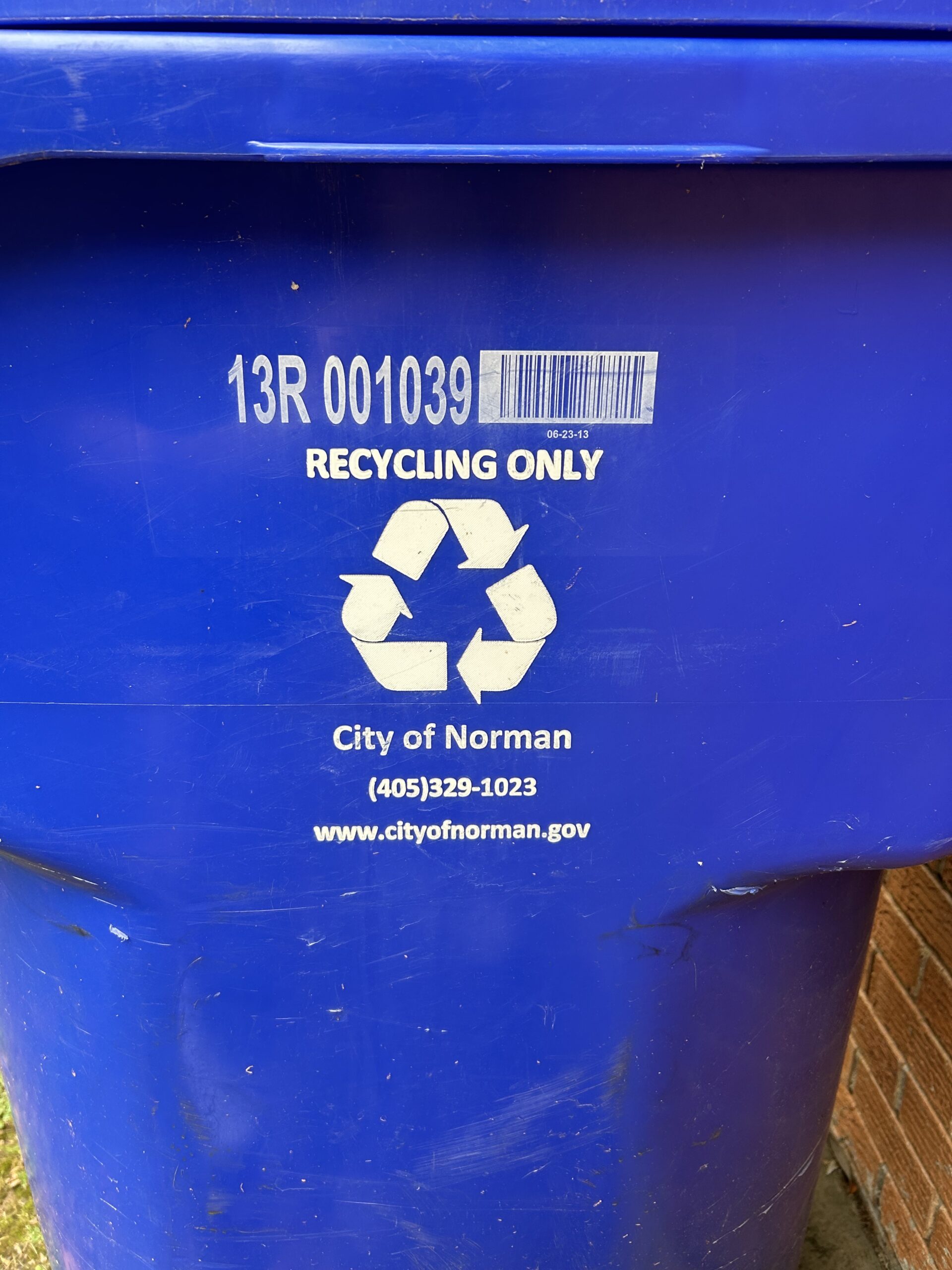
The recycling symbol on this bin is one of the most recognizable environmental symbols in the world. Even without reading the words “Recycling Only,” most people would understand the purpose of the container immediately. This demonstrates how symbols create universal communication.
The blue color also reinforces the environmental message because blue is often associated with cleanliness and sustainability. The simple layout, centered symbol and limited text make this design highly effective.
References
Adams, S. (2021). Graphic design foundations: Layout and composition [LinkedIn Learning course]. LinkedIn Learning. https://www.linkedin.com/learning/graphic-design-foundations-layout-and-composition-2013/welcome?u=2150050.
UX World. (2024, February 1). Balancing form and function in design: How to create user-friendly experiences. UX Design World. https://uxdworld.com/the-art-of-balancing-form-and-function-in-design-how-to-create-user-friendly-experiences/.